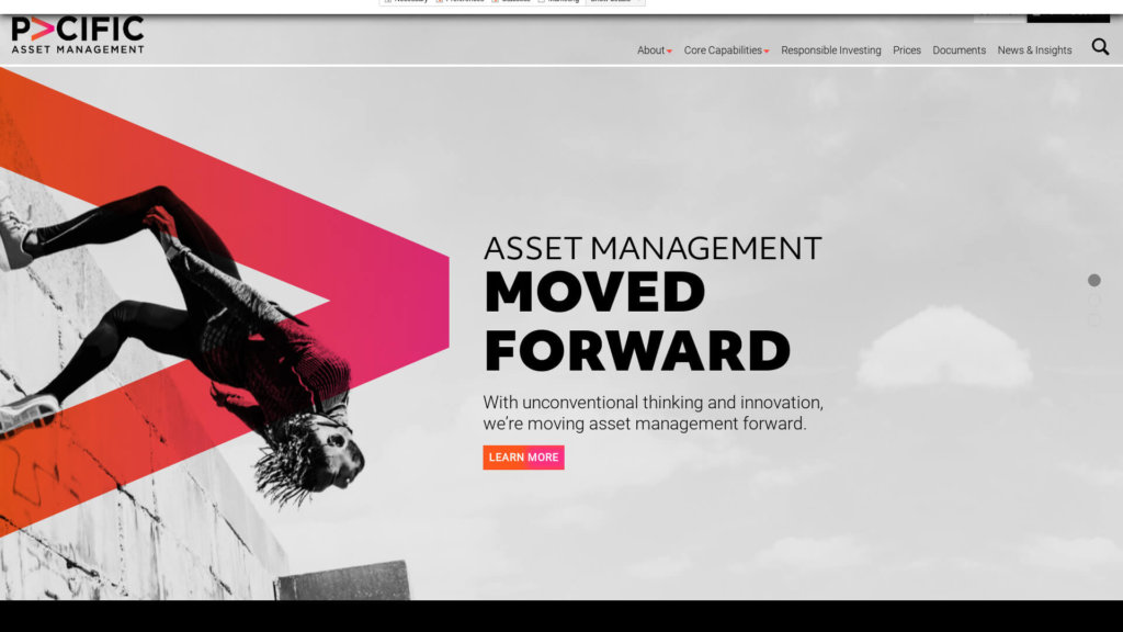
pacificam.co.uk
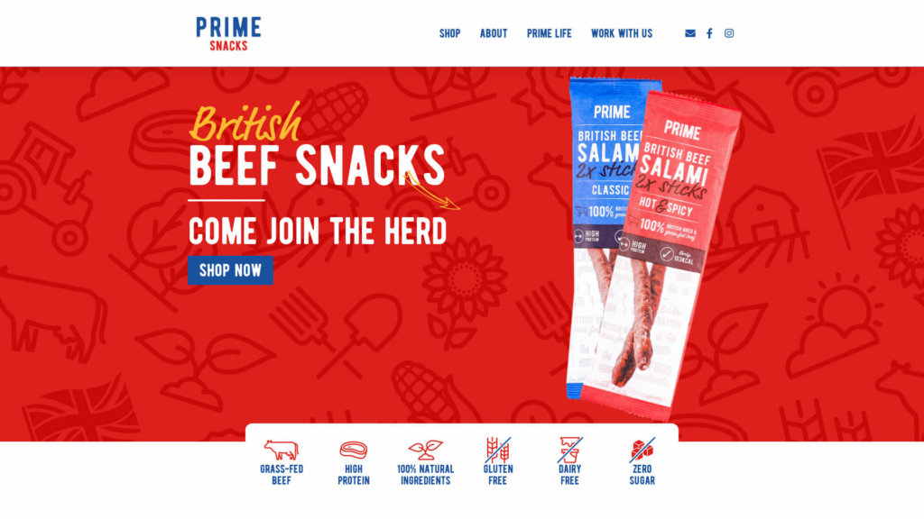
primebar.co.uk
cognoa.com
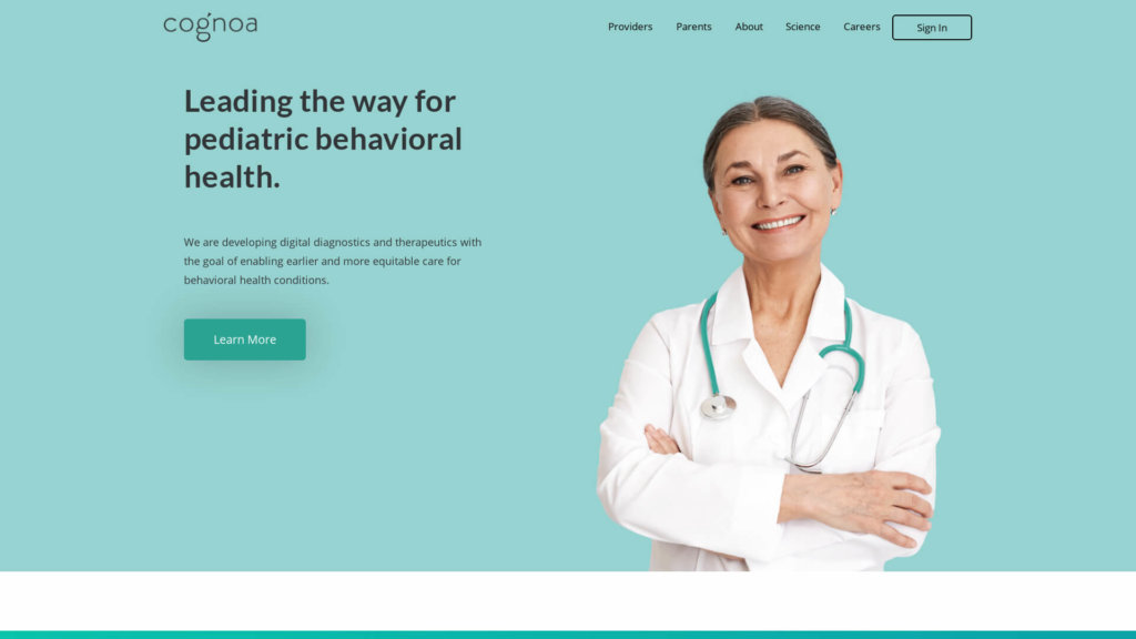
I like the clear and simple design of this medical company. Good use of images and colors. Good and to-the-point intro title and intro text. It looks a little bit strange that the intro headline is offset in the hero section. Would like to see that more aligned.
confluenceedu.com
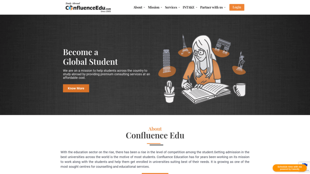
I like the illustrations on this site that is a consultant company for students abroad. Not a big fan of the font, the mix of fonts, and little to little line-height. I also don’t recommend using super-wide paragraphs. This site also lacking comepelling images and maybe a video.
coricelli.com
craftsilicon.com
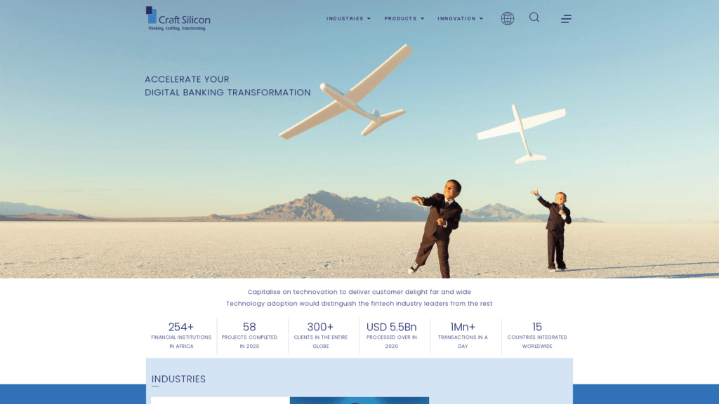
The hero image on this site for banking technology is just amazing! I love the art direction on this site. Everything fits so well together. Small animations give a smooth experience.
crankitfitness.com
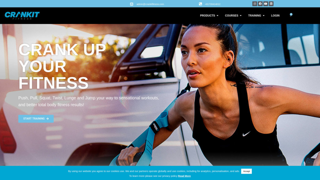
Website selling fitness products and how to become personal trainer. The site has strong images, clear CTA and the products are shown in a very good wayn in the shop with a lot of information, icons and video.
crivellari.com
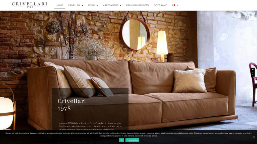
A sofa manufacturer website with potential. There are good images of the products and nice use of graphic elements. They use Premium Addons for Elementor to overtake the scrolling. I understand that the designer of this website wants that, but for me personally, it’s annoying not to have a natural scroll of a page. Also, […]
dparkphotography.com
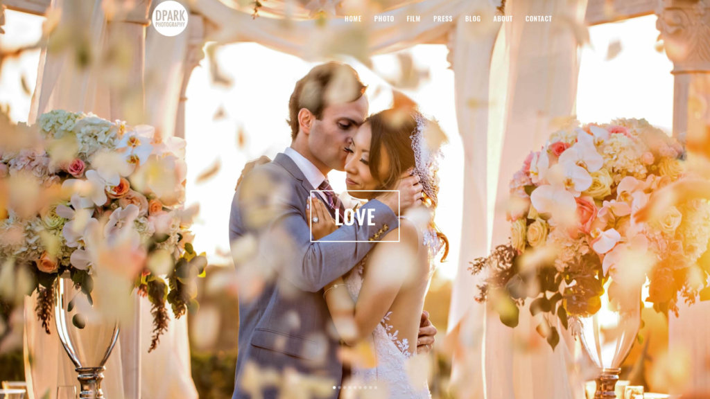
An amazing photograph company that uses this site built with Elementor to showcase the most vibrant, funny, romantic images! The focus of course on amazing images, but also press mentions and testimonies from happy customers. I also like telling the showcase video that tells the story and shows glimpses of their work. I don’t like […]
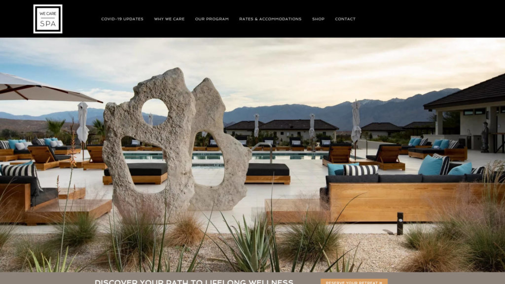
wecarespa.com